07 · Case Study
Balancing Speed and Safety in Parent Workflows
Kangarootime is a childcare product used by daycares across the U.S. and Australia. As Senior Product Designer, I led the parent-facing experience: check-in, scheduling, billing, daily updates. The stakes were higher than convenience. Privacy controls, foster-care restrictions, and dual-market compliance meant every decision had to make daily logistics feel fast without putting any child at risk. We had one advantage going in: a beta was already in parents’ hands, so the redesign was grounded in real friction rather than assumed friction.

The problem
Parents needed to handle daily logistics fast. Check-in. Schedule changes. Payments. Messaging. And they needed to do all of it with complete confidence in their child’s safety. The beta experience put uncertainty at the exact wrong moments. Drop-off. Pick-up. Incident updates. The moments where a parent has the least patience and the most at stake.
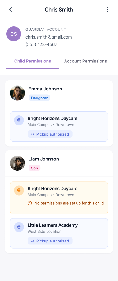
Privacy and legal constraints added serious risk, especially around photos and children in foster care where exposure could endanger families. The product also had to work in the U.S. and Australia without confusing parents or staff. Two different regulatory worlds, one app, no fork in the codebase.
The solution
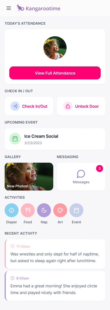
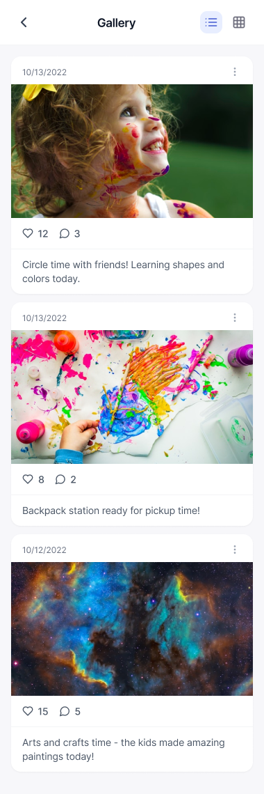
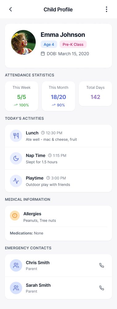
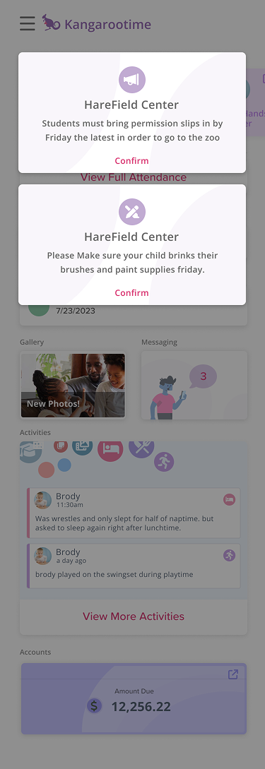
I designed a parent experience that puts the fast daily actions first. Check-in and out. Schedule and absence. Billing. Child updates. Each got a predictable entry point on the home screen. Privacy-aware media patterns protect children with legal restrictions but still let families see the meaningful moments. The home screen leads with whatever is time-sensitive that day. Below it, a scannable timeline of the day’s entries: meals, naps, playtime, notes. Regional rules adapt without changing the core mental model. A center in Sydney sees different compliance terminology than one in Boston. They use the same product.
Fast action primary flows
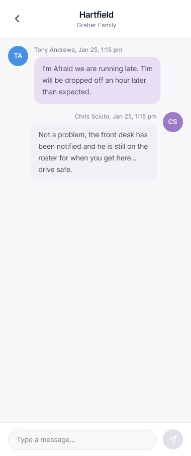
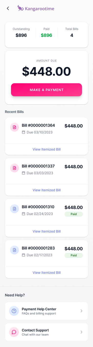
Check-in and check-out take under 30 seconds, with clear confirmations that show timestamp, child status, and what to do next. Parents get the safety reassurance they need without slowing down during drop-off. The receipt arrives at the same instant as the action, so there’s no separate “did that work?” moment.

Privacy-first photo & media controls
Strict tagging controls prevent photos from exposing children in foster care or other protected situations. Permission lives at the child, not the account, with per-relationship and per-location rules that mirror how families actually exist. The system balances the emotional value of daily photos with legal requirements and family safety, surfacing those constraints to staff visually so a hurried front desk can’t accidentally hand a child to the wrong person.

Dual-market compliance architecture
One experience adapts to U.S. and Australian requirements through a configurable rules layer. Privacy regulations, payment systems, childcare standards. All of it runs on one codebase with no separate builds. A U.S. parent sees CCDBG and ACH. An Australian parent sees CCS and BPay. Same screen, same mental model, two truths.

Research & approach
- 01 Ran interviews with parents and daycare staff to understand what happens during the busiest moments and where trust breaks down. Recruited across different daycare sizes and parent schedules, since timing changes how people use the product.
- 02 Reviewed beta product notes and support tickets to validate interview themes against real pain points, focusing on drop-off, pick-up, marking absences, paying invoices, and checking daily reports. The advantage of a live beta was that the friction was already documented; my job was to map it to design levers.
- 03 Deployed surveys showing 78% of parents check the daily timeline at least once per day (prioritizing food, naps, bathroom over general notes), 64% worry about attendance mistakes, and 59% want billing transparency. The numbers turned anecdote into priority order.
- 04 Conducted card sorting to validate how parents naturally group features. Attendance actions cluster together. Updates and photos form a wellbeing bucket. Billing groups with administrative tasks. The IA followed the parents’ mental model, not the org chart of the engineering team.
- 05 Created personas by clustering patterns around frequency of use, time pressure, and reassurance needs, including constraints like shared custody, foster care privacy requirements, and different family structures. Personas weren’t about demographics. They were about the trust-vs-speed tradeoff each family had to navigate.
- 06 Ran usability testing with parents and staff on high-frequency, high-stress scenarios. Observed a consistent pattern: parents move quickly until they hit uncertainty, then slow down and double-check, especially around attendance and payments. Designed against that hesitation by surfacing confirmation visibly the moment an action lands.
The redesign gave parents the confidence they needed while making our daily operations smoother. It’s rare to see a product that gets both speed and safety right.
Daycare Operations Director · Multi-Location Childcare Provider
Team & leadership impact
- Led
- End-to-end parent product experience as Senior Product Designer
- Partnered with
- Parents and daycare staff in research, product and engineering in build, regional operations in compliance
The shipped product gave Kangarootime something the beta couldn’t: a parent experience that operations directors could point to as proof that the company took child safety seriously. The dual-market architecture also gave product a model for future regional expansion. The rules layer became the template for any market the company would touch next.
What I’d do differently
We invested heavily in the parent experience before fully retooling the staff-facing companion. The result was a beautiful parent app whose safety guarantees depended on staff using a much less polished operations interface. Permissions are only as strong as the people configuring them, and we asked the staff side to do a lot of heavy lifting on a UI that didn’t make it easy. If I were running it back I’d ship the parent and staff sides as one effort, or at least sequence them so the staff workflow was redesigned first.
A 30-second drop-off for the parent rushing into the lot, per-child permission rules for the foster family the lot doesn’t know about, and one codebase serving Brooklyn and Brisbane the same way — that was the shape of the product when it shipped.