04 · Case Study
One Platform, Two Worlds: Mobile and Web Alignment
Helixintel’s CMMS had been pulled in two directions for years. A desktop product for managers. A thin mobile app for technicians in the field. A growing identity gap between them. As Lead Product Designer, I led the year-long overhaul that brought both surfaces under one design system. The product gained a coherent identity, and Customer Service finally had answers for the complaints they’d been hearing for years.

The problem
The CMMS had a desktop identity bolted onto a mobile shell. The actual users (technicians closing work orders in boiler rooms and on rooftops) were on a UI that assumed a mouse, a 1440-pixel-wide screen, and time to think. The mobile app had been treated as a smaller version of the web app rather than its own surface, and the two had drifted apart in patterns, vocabulary, and behavior.
Internally, this showed up as fragmented work. Every new feature shipped twice, in two different idioms, with two different sets of tradeoffs. Customer Service tickets cited confusion that wasn’t about broken functionality. It was about a product that didn’t feel like one product. For an enterprise CMMS where field accuracy is the whole business case, that incoherence was a liability.
The overhaul didn’t just modernize our interface. It gave us a coherent product strategy we can build on. Customer Service finally has answers for the complaints we’ve been hearing for years.
VP of Customer Success · Helixintel
The solution
I led the design team through a full overhaul anchored on three commitments. Build the mobile app as a field tool in its own right. Make every screen explain itself. Align every module (Properties, Equipment, Work Orders, Requests, PMs) on the same component library. Two worlds, one platform.
Field-first mobile architecture
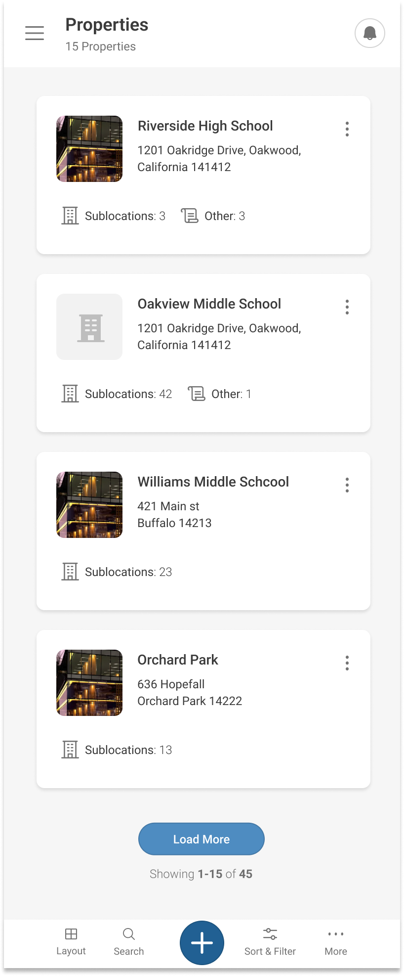
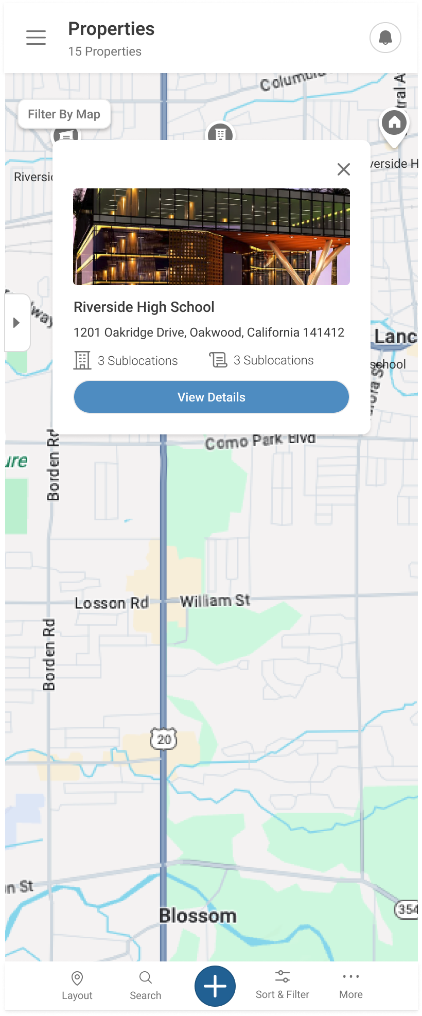
The mobile experience was rebuilt around the technician’s actual workflow: scan a list with full record cards, locate a property on a map, expand the detail inline. Touch targets sized for gloves and motion. Information hierarchy assumes a glance, not a study. The mobile app earns its right to exist by being a better field tool, not a smaller desk tool.

Explicit in-product guidance
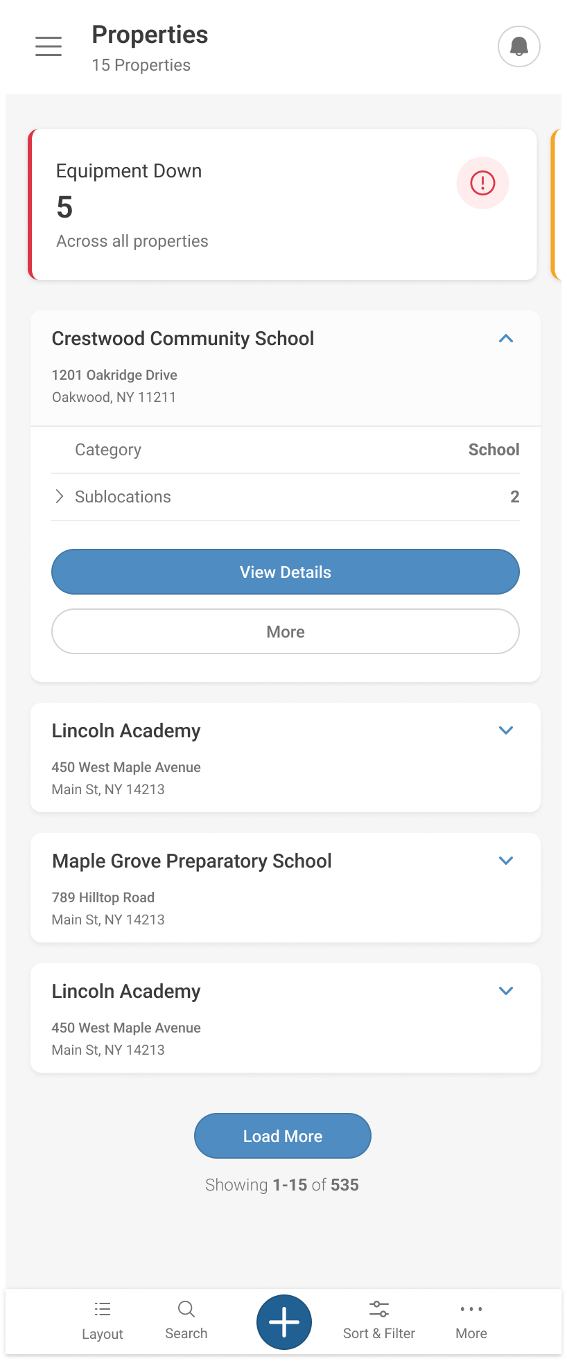
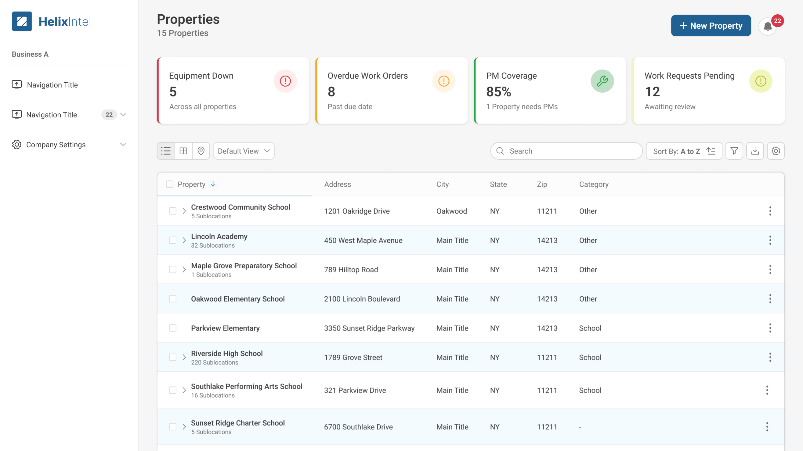
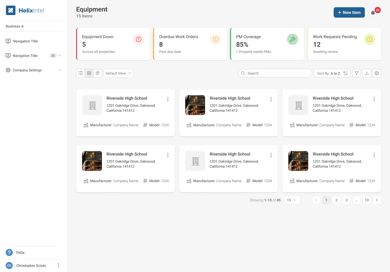
KPI cards became the documentation. Every dashboard tile carries a status color, a clear label, a secondary explanation, and an icon that matches the state. “Equipment Down: 5 across all properties.” “PM Coverage 85%: 1 property needs PMs.” The screen tells the user what it means and what to do next. No training session required. No tribal knowledge passed person to person.

Unified cross-module patterns
Properties, Equipment, and Work Orders had been three different mental models. The overhaul collapsed them onto a shared page chassis: the same header layout, the same KPI bar, the same view switcher, the same record cards, the same status pills. Once a user learns one module, they have already learned the rest. That’s the consistency that turns a collection of features into a product.

Research & approach
- 01 Ran field shadowing with technicians at customer sites: boiler rooms, rooftops, trucks. A desktop UI shrunk for mobile becomes impossible to defend the moment you watch someone try to use it with gloves.
- 02 Audited every screen across both surfaces against the desktop and mobile heuristics in parallel, cataloging divergences in spacing, vocabulary, action placement, and information density. The audit turned vague complaints into a specific inconsistency map the team could attack.
- 03 Worked with Customer Service to mine support tickets for the exact phrases customers used: “I can’t find,” “the app says different than the web,” “is this saved?” Then mapped those phrases to the underlying UI failure modes. The tickets were a research corpus we’d been ignoring.
- 04 Built the shared component library before redesigning any page: KPI card, record card, status pill, view switcher, primary action. Every page got rebuilt out of the same parts. Designers and engineers worked from the same library, in two-week design-system increments, before any feature work shipped.
- 05 Sequenced the rollout module by module. Properties first, then Equipment, then Work Orders. Customers experienced compounding consistency rather than a single big-bang launch, and by Work Orders they were already fluent in the chassis.
- 06 Partnered with VP of Customer Success on a beta cohort of enterprise customers to validate patterns in production before broader rollout. The beta surfaced field-specific edge cases (offline capture, low-signal areas, glare on phone screens outdoors) that lab testing never would have.
Team & leadership impact
- Led
- Lead Product Designer at Helixintel, end-to-end across mobile and web for the year-long overhaul
- Partnered with
- VP of Customer Success, Product Director, Customer Service leadership, enterprise insurance partners, mobile and web engineering teams across the year-long platform overhaul
The contribution wasn’t a screen redesign. It was a working model for how Mobile and Web could ship together again. A shared component library. A shared review rhythm. A shared definition of done. The patterns we established became the template the team now uses for every new module, and the alignment with Customer Success turned design into a partner that helps close support tickets rather than create them.
What I’d do differently
We staged the rollout module by module to manage risk and let engineering keep pace. That was the right call, but it meant customers lived with a partly-new, partly-old product for months. If I were running it back I’d invest harder in a visible “modernization status” surface inside the app so customers and CS could see the plan, track the cadence, and know which screens to expect changes on next. Transparency would have absorbed a lot of the “why is this different now” tickets that showed up mid-rollout.
By the time Work Orders rolled out, customers were already fluent in the chassis. The next module shipped faster than the last — the compounding return on shared components, measured in calendar weeks.